Photography: Gert Jan van Rooij
by Yoko Choi

Photography: Gert Jan van Rooij
We’re still thrilled about the celebratory cover Philippe Apeloig created for our 200th issue in October, but the designer has since been busy with an important show in Amsterdam, the city that launched his career.
The ties between the French designer and Dutch design often go unremarked, but one can see the influence of Dutch modernism in Apeloig’s work – in his precision, outlines, minimalism and grid. Apeloig first went to Amsterdam in the 1970s, while he was studying at the École Nationale Supérieure des Arts Appliqués Duperré in Paris. While there, he was offered what was to be a life-changing internship at Total Design, the firm co-founded by Dutch graphic design guru Wim Crouwel.
Carolien Glazenburg, curator of graphic design at Amsterdam’s Stedelijk Museum, has been collecting Apeloig’s works since the turn of the new millennium, notably his posters. ‘Nowadays, people are not used to looking any more, but in these giant posters, the closer you look, the more you see,’ she says. Apeloig donated most of the posters in the show to the museum, where they will join its permanent collection, alongside his early Dutch modernist influences, such as Mondrian.
‘Posters are like paintings,’ says Apeloig. ‘Which makes me think of the graphic and pictorial work of the constructivists, with their palette of primary colours – which inspired me greatly.’
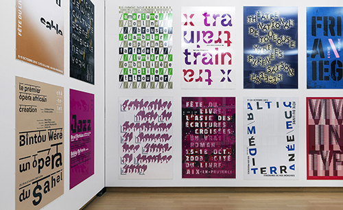
The main exhibition room aims to bathe viewers in type; posters are arranged by hue instead of chronologically. Take a close look at his famous institutional design for the Théâtre du Châtelet in Paris and the Fête du Livre in Aix-en-Provence, or his competition entry for Le Havre World Heritage poster design. Apeloig’s letters display a range of personalities: sometimes they stand singly, other times as part of a group; sometimes the effect is boisterous, at other times muted. In the centre of the room are four small showcases containing publication designs, including the pink and blue version of the Wallpaper* 200th issue.
Among the first designers to use computer technology in graphic design – a result of his internship with April Greiman in the USA in the 1980s – Apeloig often creates visual illusion and movement with type. The second room of the exhibition pays tribute to his animated works, which are rarely shown on the big screen, and features motion clips on smaller monitors to show his logo designs in progress. Outside the room are three iconic posters from Wim Crouwel, Wolfgang Weingart and April Greiman, which not only help the visitor to understand the source of Apeloig’s early inspirations, but are also a sentimental tribute to the designer’s mentors.
Using Type: Philippe Apeloig’s work on show at Amsterdam’s Stedelijk
Presse, November 10, 2015
http://www.wallpaper.com/art/using-type-philippe-apeloig-work-on-show-at-amsterdams-stedelijk-museum