Capturing the moment and instilling graphics with movement
by Noriko Kawakami & Junya Igarashi
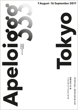
An exhibition by the major French graphic designer Philippe Apeloig was held from August to September in Tokyo. We talked to Apeloig who is known for his original, emotion-filled lively typefaces and design that makes effective use of typography focusing mainly on French cultural institutions.
Forms with meaning
The first time Philippe Apeloig held a solo exhibition at Ginza Graphic Gallery (ggg) was in 1998. This summer, nearly 20 years later, Apeloig’s new work were unveiled at the same gallery. The well-ordered venue composition was based on Apeloig’s idea to have visitors fully savor a sensibilité steeped in design.
Apeloig was born in Paris in 1962, studied calligraphy at L’École Nationale Supérieure des Arts Décoratifs (ENSAD), and interned at Total Design in Amsterdam, the Nertherlands, in ’83 and ’85. Inspired by his work at Total Design that combined the sternness of modernism with radical elements, Apeloig turned away from his aspiration to become a painter and stage prop designer. His first job was for Musée d’Orsay where he worked for three years from ’85. At that museum, which opened with logo design by Bruno Monguzzi, Apeloig was in charge of posters and other designs. Later, he was in charge of the design of exhibition posters and invitations as art director at the Louvre Museum.
Frozen movement
The design of Apeloig, who continues to pay extreme care to typefaces and typography, is characterized by expressions richn emotion. His designs come alive as if one were watching a scene from a film or play.
« Perhaps the charm of typography is that it allows me to experiment in imparting movement to posters that are essentially static by using rhythm, spatial configuration, and methods of presentation, » Apeloig says.
For three years from 2000, Apeloig served as curator at the Herb Lubalin Study Center at The Cooper Union’s School of Art. The eminent American graphic designer Herb Luballn too stressed the movement of words, and placed importance on feeling movement as sound.
« As Lubalin said, people are charmed by the design of fonts and layouts, precisely because they are meaningful. Typography makes possible rich, eloquent expressions. Just like the moving architecture of Bauhauss Oskar Schlenmer or dance on stage, I’ve always wondered if I could incorporate accidental events and express them using movement, » Apeloig says.
In order to achieve that, Apelolg uses a grid and conducts detailed tests of his design at every stage. A good example among his recent projects is the graphics for the bottles of the L’Eau d’Issey perfume series where he gracefully arranges text like cutout pictures.
« Since the bottle design itself is widely known, I designed an original logo with the English letter i, reflecting the bottle’s shape The white space that looks like it’s missing text is empty form. Movement is born precisely because ot that emptiness, and vision is restructured from that space:, » Apeloig says.
Elsewhere, in a poster titled Boats on the Water, Eivers, and Canals French Waterways, boats moving across the surface or the water were depicted as typography. In addition to the movement of the boats and context of the scenery, the poster evoked the sounds of the place itself. Apeloig uses the term « frozen movement » to express this design that captures the moment Apeloig’s design comes into being through focusing on moments.
From craft work to 21st century expressions
A project Apeloig is working on at present is a signage plan for the Louvre Abu Dhabi in the United Arab Emirates scheduled to open in November. The museum building designed by Jean Nouvel allows light to pour in like rain from gaps in the ceiling, and Apeloig is developing logos and signs inspired by that scenery.
Apeloig’s design that values discovery in the produetion process can also be observed in the logo for the Yves Saint Laurent Museum completed in Marrakech this fall. Apeloig first turned his attention to the m that’s in common with « museum » and « Marrakech » and focused on the fact the letter resembled the traditional shape of Marrakech architecture. In addition to symbolizing the shape of Morocco’s ceramic tiles, the four-sided shape also fits with the geometrical forms of artist Piet Mondrian that appealed to Saint Laurent. Apeloig verified the design in a craft-like approach that’s clearly demarcated from design in the digital age, and finished it in a 21st century expression.
« The role of the artist is to communlcale the beauty existing in the world. Artists also bear the responsibility of continuing the free use of words. There are diverse ways to express that, » Apeloig says.
Apeloig’s design searches for each characteristic of the message to be expressed while maintaining a footing in design discipline and also combining it with humor. The spirituality and activity of people who have acquired fonts and have conlfnued to send their messages, and people’s innovativeness and diverse emotions are packed into designs that begin with the careful design of fonts. This is the same with his light-hearted, pop design. That’s why Apeloig’s design reverberates strongly in our hearts together with a feeling of vibrancy and life.
Capturing the moment and instilling graphics with movement
Presse, December 2017
