Marking Type
Wallpaper
by Carach Mckay
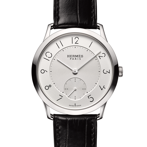
As the wold gets to grips with the pros and cons of wearable technology, La Montre Hermès reminds us of the ingenuity of traditional watch design. Though its new Slim d’Hermès watch could rely on good looks alone, Hermès has added a typically stealthy design flourish: the hour markers have been designed by the French graphic designer Philippe Apeloig.
Says Hermès artistic director, Pierre-Alexis Dumas, ‘Typography is a key part of Hermès, and our creative director at La Montre Hermès, Philippe Delhotal, has long been obsessed with finding a designer who could work on a micro scale. The physical design of the watch is very elegant, light and discreet, and there had to be a connection between the font and the moment. The watch design also allowed a nice, open dial, which left a beautiful space for the typeface. I wanted to work with Apeloig because of his didactic style, that essential approach that says, “What can I take away?”’
And, having invited Apeloig to redesign the identity of Puiforcat, the Hermès-owned silversmith, Dumas approached him to collaborate with Delhotal on the watch. Apeloig liked the idea ‘Most of my work involves working with type and letters, but here you have to invent something because the numbers already exist. The Slim d’Hermès font is a combination of straight and curved lines, very fine; a single line that is broken wit no difference in thickness. It is simple, sober.’
Despite the limitations of scale, Apeloig was non-plussed. ‘You have to think of the function, so the font has to create an interesting dialogue between the numbers and the shape. It really should not be an effort to see the numbers when you glance at the watch –they have to be obvious.’
The font not only defines the watch’s light character, but, as with all La Montre Hermès’ horological endeavours, there is a sly, humorous tick: ‘The broken lines are there to create a silence; a hiatus, like the “start and stop” of time,’ says Apeloig. ‘That they are not complete creates the lines together but also the viewer to look.’
Marking Type
Wallpaper
Press, July 2015
