Design Deconstructed:
Why Philippe Apeloig’s
1987 Musee d’Orsay Poster
Is A Masterwork
by Ellen Lupton, Cooper Hewitt's Contemporary Design Curator
Experts see the world differently than those with an untrained eye; they pick up on details, techniques, and historic references that might otherwise go unnoticed. The Design Deconstructed series taps into how they examine, interpret, and understand the world. Think of it as a crash course in understanding visual culture.
The first installment comes courtesy of Ellen Lupton, the accomplished author, professor, and curator of contemporary design at the Cooper Hewitt, Smithsonian Design Museum.
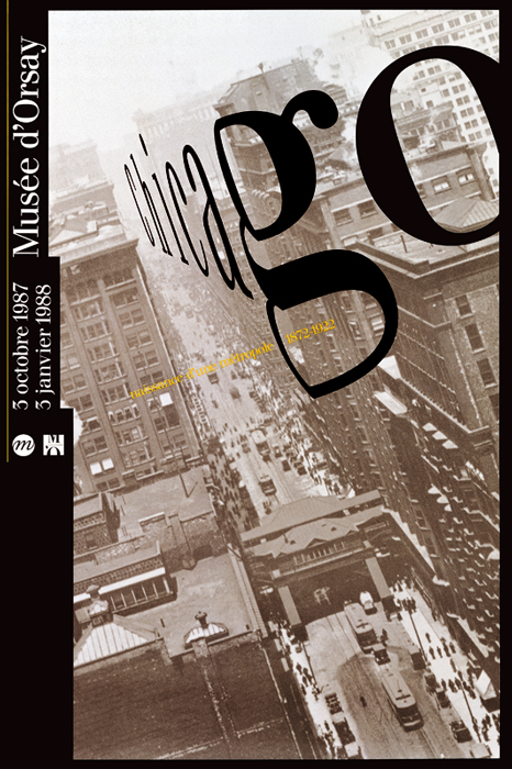
The object Lupton unpacks is French graphic designer Philippe Apeloig‘s poster for the 1987 Chicago, Naissance d’une Métropole exhibition at the Musee d’Orsay, which is currently on view in the Cooper Hewitt’s How Posters Work show, which is open through November 29, 2015.
Co.Design: Tell us a bit about the designer. What’s his hallmark?
Ellen Lupton: Philippe Apeloig is a wonderful French designer working in Paris. He is known for his rich, experimental typographic style. He treats type the way a painter treats paint: as a magical substance with its own will to power. He builds his own letterforms from bits and pieces of punctuation as well as constructing, bending, smudging, and warping text through a variety of digital and physical means.
What about the poster appeals to you?
Apeloig created this famous poster early in his career. In 1987, designers were just beginning to have access to computers. Apeloig worked not with a desktop computer and commercial software but with high-end CAD-based typesetting equipment that at the time was used exclusively for technical purposes—graphic designers rarely had direct access.
What do you look for in a poster? What elements do you evaluate when you’re assessing its design quality?
Some posters primarily function to sell a product or push a message. This poster announces an exhibition at Musee d’Orsay but it also aspires to function on its own as a cultural interpretation. Museum posters sometimes have this dual function of serving an immediate communication need while also becoming a lasting record of that event. The exhibition Chicago, Naissance d’une Métropole is long-gone, but this poster is a lasting icon.
What makes the type, imagery, and messaging especially strong?
Apeloig was able to work with CAD software to distort his letterforms and create the illusion of three-dimensional space. His typography captured the dynamism and depth of this historic photo of Chicago. The photograph presents the city at a dramatic angle, and Apeloig has skewed his type to heighten the image’s speed and vertigo.
Can you explain the poster’s historical significance, specifically what the Musee D’Orsay signaled with this design?
Musee D’Orsay had recently adopted a new graphic identity, and the museum hired Apeloig—a very young designer who was not yet out of school—to become the museum’s in-house graphic designer. Apeloig gave the position his entire heart, treating every element as a kind of sacred trust with the public. An exhibition poster is, potentially, a utilitarian artifact, but this poster goes way beyond that.
What do you think constitutes a strong design, generally speaking?
The best design speaks to users and the public, fulfilling its role as communication, but it also contributes to a larger discourse about design’s potential for innovation.
Design Deconstructed:
Why Philippe Apeloig’s
1987 Musee d’Orsay Poster
Is A Masterwork
Press, July 28, 2015
