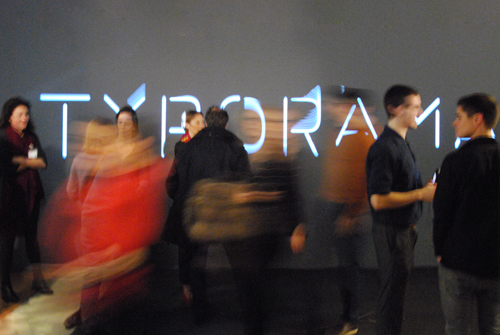
Photo: Ben Bos, 2013
by Steven Heller

Photo: Ben Bos, 2013
An exhibit and book about the work of typographer Philippe Apeloig marks the culmination of an extraordinary career and, he says, the start of a new artistic phase.
To the uninitiated, the art of typography may not sound like much of an art at all. Anyone can mess with fonts, right? The truth, though, is that even trained veteran graphic designers can be poor typographers—it is not easy to be good.
But Philippe Apeloig, a French poster designer and typographer, is good. One of the best, actually. Last Friday marked the final day of a six-month retrospective exhibition, “Typorama, Philippe Apeloig, Design graphique,” at the prestigious Musee Les Arts Decoratifs in Paris, feting Apeloig’s life work and achievements. The exhibit showed off his posters, typefaces, books, and corporate identities, celebrating his contributions to French design culture. Design connoisseurs in America, meanwhile, can check out an inclusive monograph, Typorama: The Graphic Work of Philippe Apeloig, from Thames + Hudson.
The book follows Apeloig’s creative trajectory from bouts with Modernism and Postmodernism, from his adherence to and emancipation from the classic grid, to his increasingly abstract experimentation with type, image, and color. You can see how there evolved a distinct Apeloig character or style that is at once ordered and anarchic. After assimilating a range of influences from the likes of digital queen April Greiman, typemasters Wolfgang Weingart, Wim Crouwel and others, Apeloig’s approach is decidedly and distinctly his own.
After touring through the exhibition in Paris last December, I asked Apeloig to tell me how his design ethos came about. He explained that his “sensitivity for typography” emerged from what he learned as an intern at the Dutch firm Total Design, known for its Modernist rigors, which inspired him “into the objectivizing functionalism, rigorous and abstract aesthetic.” Apeloig added that he sees himself as the French link to the Dutch design approach. “However,” he said, “I have other influences from pictorial, literature, and performing-art resources that impacted my vision and my way of being a designer—something unpredictably French that connects me to a more lyrical, emotional, and expressionist design.”
Typical French design, he explained, can be described as the result of “multiple interpretations coming from the Swiss influence (Adrian Frutiger and Jean Widmer), the Polish school of posters (Roman Cieslewicz), advertising and the hand drawing (Savignac), the French tradition for stylish and exuberant typography (Roger Excoffon) and avant-garde publishing (Massin and Faucheux).” In some way, he noted with a French turn-of-phrase, “I was contaminated by all of them.”
Apeloig’s work is unapologetically cerebral, yet he also injects emotional bits that are revealed in three standout features of Typorama. First, many posters offer multiple iterations (sometimes as many as nine each) on a single theme, with results that and are often radically different from one another and yet nonetheless show Apeloig’s mathematical precision. Second, pages in the book (and videos in the exhibition) evince how Apeloig rhythmically orchestrates his custom letters to match the themes of his posters. Third, his custom typefaces, almost all of them variations of the stencil family (which are Apeloig’s favorites because stencils are such unpretentious letterforms) reveal a playful approach to making letters.
After well over 30 years, Apeloig added that his work “belongs to the French design context and history” because he contributed to such important cultural institutions such as the Musée d’Orsay and others for which he designed corporate identities, books, and covers.
At 51, Apeloig sees the exhibition and book as the beginning of the next stage. “Very often I think about taking another direction in the creative field, simply because I never ever [planned] to become a designer,” he said. “My heart was in painting, drawing, and literature, and it still resonates. Today, I wish I can be strong enough, well prepared enough in my mind, to consider that my contribution to graphic design can end slowly after the exhibition is over and the Typorama book is published. I am aware that keeping working the same way doesn’t represent the same challenge any more. And I need new dreams.”
A New Legend of French Design The Atlantic
Press, April 3, 2014
www.theatlantic.com/TyporamaExhibition